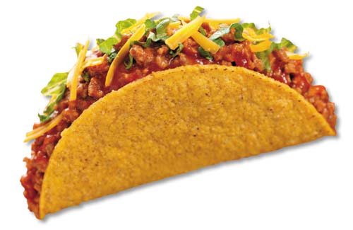
The shape hasn’t changed for centuries. It’s recognizable, functional and if you like cheap Mexican fast food, it tastes good.
A taco is a taco.
Or is it?
In General Mills ongoing quest to make American’s fatter, they decided the taco needed a re-do. So the test kitchens came alive as the foodologists crafted a bigger, better taco. One that holds more meat, more cheese, more lettuce, more tomatoes, more belly busting goodness to satisfy our cravings – AND it stands up on its own making it easier to fill.
Nobody would have thought that something as simple as a taco would need to be redesigned, but it did because consumer demands changed.
In a typical day, I visit 30+ eCommerce stores looking at how they’re designed, what features they use to draw customers in and lead them to the checkout, what platform they’re built on, and most importantly – their layout and design.
I come across a lot of tacos every day.
They’re pretty easy to pick out. The copyright date in the footer hasn’t been updated since Clinton was in office and the design hasn’t either. Times New Roman is the font of choice, big red text prevails where attention is needed and the graphical elements that make up the site are as tired as a sled dog at the end of the day.
Your website is a direct reflection of your business. You wouldn’t open up a brick and mortar store then bring in Fred Sanford as your designer. Image is everything and you only have a few seconds to portray a professional image to a shopper, so don’t blow it.
Many store owners I talk to are afraid to embark on a redesign. Not because of the cost involved, but because they’re afraid to touch their site “because it works.” Old El Paso didn’t redesign the taco because it was broken, they redesigned it because times changed and consumer demand changed. Your site may “work” but imagine the potential it has if you give it a refresh that includes conversion increasing features, a better navigational structure, and an easier way to buy and check out.
In the normal cycle of eBusiness, an eCommerce store should be redesigned, at the least, every 18-months. In between the site should be tweaked as new features are introduced and graphics should be refreshed according to seasons. An up-to-date website instills confidence in a visitor’s mind and generally leads to a sale or at minimum a repeat visit.
By investing in a good looking, up-to-date, functional eCommerce store, you’re investing in the future of your business. Remember…. a redesign doesn’t cost. It pays.

