Like you, I got a butt-load of email promoting Cyber Monday sales. Some from stores I buy from, others from companies who just like to spam people.
Being a big sales day, I would expect that merchants would take the time to make the Cyber Monday email blast the most compelling, best dressed email of the year. Eye catching graphics, motivating calls to action and above all, a good deal. Everything necessary to catch the reader’s eye and get them to click through and make a purchase.
Makes sense right?
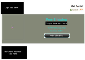
One email I received on Cyber Monday was a prime example of email marketing gone bad. Take a look at it (you can click the image to enlarge it):
To protect the store owner from embarrassment, I’ve gone ahead and blacked-out any identifying marks, but left the entire email visible. So let’s go ahead and dissect this beauty:
- Broken Image – never, ever hit that send button until you’ve previewed, double checked, and triple checked your email for broken images and incorrect links. I looked at the source code and found the URL for the image, and when put into a browser it brings up a 404 error – page not found.
- Color Selection – the shade of greyish-green as background for teal text was a bad choice. It’s not only hard to read, it just doesn’t match.
- Use Transparent Images – the “Visit Our Site” image should have been saved as a transparent image so it blended into the background better instead of sticking out like a sore thumb with it’s white background.
- Calls to Action – sadly, there is nothing here that screams “Come to Our Store!” No imagery, no strong calls to action, no real sense of urgency.
- Design – is there really design here? Most email marketing programs give users a template gallery with some professional looking layouts. If you don’t have the graphic design and programming skills to design your own template, or can’t afford to have one made for you, these templates are better than nothing.
So how could this email be improved? Oh, let me count the ways.
- Design – a good standard template or custom designed template would improve the overall look of the email greatly.
- Feature Products – people want to know what you have for sale in your store. A few pictures of some best selling items along with sale prices would be good.
- Free Shipping – don’t want to feature specific products? Have a collage of your best selling items with “Free Shipping” as a graphical call-out to drive attention to the free shipping promo you’re running store-wide.
- Some Text – talk a little about your sale, but don’t overburden the reader with tons of text. A few lines talking about the sale and what you’re offering helps.
- Sense of Urgency – this is a limited time offer, a simple text link that says “Hurry One Day Only” isn’t creating much urgency. A graphical call-out with something like “Only 24 Hours Left!” or “Sale Ends at Midnight Tonight” may be a better choice.
These are just a few of the ways this email could be improved upon, but you should get the point – professionalism sells. Unfortunately, this email doesn’t.
Now I don’t like to call out store owners blunders, but calling attention to things like this only helps all of us. If this caused you to go back and look at your email marketing campaigns to see if you’re doing the best you can do, I did my job.
Competition is fierce and most of the time we’re all reaching for the same piece of pie. By taking the time to do things right, chances are you’re going to be the one smacking your lips enjoying a nice piece of Apple Crumb.
P.S. There’s still time to do some email marketing to capture those holiday sales. Check out this recent blog post that talks about ways to improve your outbound email campaigns.

