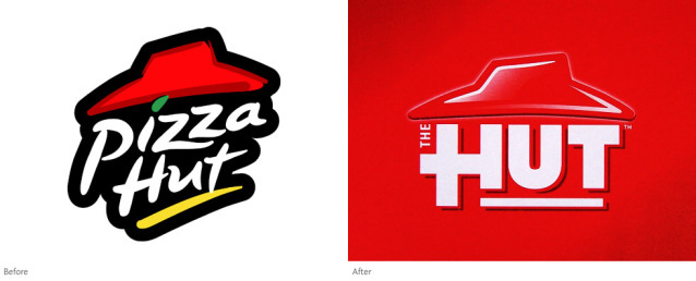
I stopped for pizza tonight at what I thought was Pizza Hut. (Yeah, yeah. I know. I was a bad Italian, but I like it.) The place looked like Pizza Hut, had the aroma of Pizza Hut, but something was different. The “Pizza” was dropped from the company name and it’s now simply known as “The Hut.”
Huh?
I have to wonder what goes through the high-paid marketing people’s brains when decisions like this are made. I would have loved to be in that meeting when someone said, “I think we should take pizza out of our name and just be known as The Hut.” Radio Shack was thinking about dropping “Radio” from their name and just call themselves “The Shack.” Well, they do. Kinda. They didn’t officially change the name or tinker with the logo, but they market around being known as The Shack.

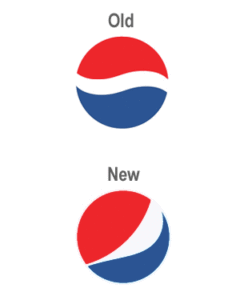
With Pizza Hut a division of Pepsico, this might just be the brainchild of the person who convinced someone high enough up in the company to change the iconic Pepsi logo.

Both of these moves remind me of “New Coke.” Children of the 80’s will remember that fiasco, those of you who don’t know what I’m talking about, go to Google. I was a little dismayed when Kentucky Fried Chicken decided to go by KFC because they didn’t like the connection with “fried” in their name. Hmmmm…. how do you cook that chicken? You fry it! I don’t think anyone would go to Kentucky Fried Chicken looking for boiled chicken.
I remember the first time I saw the new Pepsi logo. I stopped, took a double take, wiped a tear from my eye and shook my head in disbelief. A logo change is an expensive undertaking. All those vending machines, soda fountains, delivery trucks, tractor trailers, signage, uniforms, whatever need to be redone. Is it really worth it? Thank God they didn’t tinker with the formula.
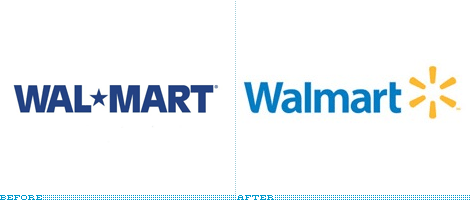
Walmart felt they needed an update to their image when they rolled out their new logo. I hated the old one, in fact I hate Walmart, so I won’t give them too much attention. But their change was needed to take them from the 1970’s into the 2000’s. Let them spend all of Sam’s money changing signs and relettering trucks, they can certainly afford it, and I won’t lose any sleep over it since it is a great looking logo.

I’m a stickler when it comes to branding. A lot of money is spent getting people to connect an image with your company name. To change that is risky. I was afraid to add a little twinkle to my company’s logo or even add a drop shadow. I just hope I don’t wake up one morning and see the styled “Coca-Cola” logo restyled using Comic Sans.
